The following case study was conducted to increase the conversion rate of a furniture e-commerce website by reducing customer anxiety on product pages. Reducing shoppers’ anxiety is important for successful conversion optimization. This can be done by addressing customer’s fears and questions about product quality, service quality, product description, website security, pricing and so on.
The Company
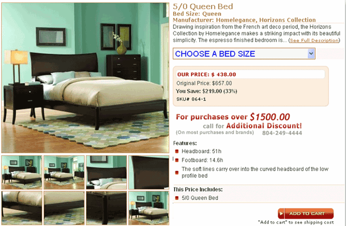
The company under study is one of USA’s largest online furniture retailers operating offline since 1913. The website has an overall conversion rate of less than 1% and an average order value of $2,200. The bottleneck for conversion seems to be the product page as only 1.7% of visitors click the Add To Cart button.
Hypothesis
Conversion rate of product pages can be increased by providing easier access to important product information. This can be pricing, description, product options, or making the Add To Cart button very visible. By providing easy access to these elements, conversion rate can be increased and visitor anxiety can be reduced. This process also addresses all the needs of impulsive shoppers who want to be done quickly with their shopping.
Original Observations From The Website
- Both the Call To Action button and product select options were placed below the fold. Placing the CTA below the fold reduces buyer momentum and increases FUDs.
- Product page was not catering to buyers with impulsive persona.
- Unnecessary elements such as the SKU number are taking up prime real estate. These elements do not meet visitor’s needs.
- Other important elements such as the product description were present above the CTA as well.
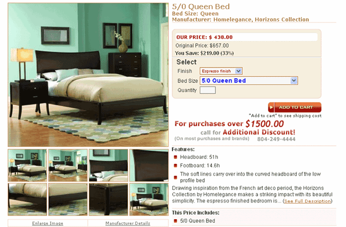
E-commerce Product Page Variation 1
The Call to action button placed above the fold to increase buyer momentum. All product options made available about the fold to address shoppers with impulsive persona. Unnecessary elements such as the SKU,was placed elsewhere on the page. The product description was moved below the CTA in order to increase CTA visibility.
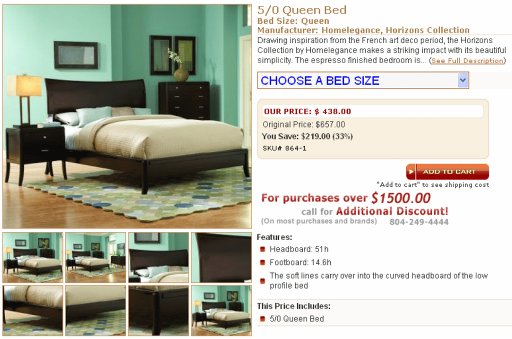
E-commerce Product Page Variation 2
Increased buyer momentum by placing the Call To Action button above the fold. That was the only change for this particular variation.
Results
Variation 1 won the test. By moving the Call To Action button, adding product select options above the fold and shifting unnecessary elements below the fold, the client gained an overall increase of 108% in website conversion. This points the importance of improving buyer momentum by providing sufficient scent on the page.
Lessons Learned
- Product page is one of the most important pages of your e-commerce conversion funnel. It provides more flexibility for persuasion.
- Product Page Effectiveness Rate (PPER) is directly related to average order value.
- Higher Product Page Effectiveness Rate (PPER) can be achieved by reducing customer anxieties, and by allowing easier access to CTA and product options.
- Unnecessary elements on the product page wastes user’s time and can impact your overall website conversion rate.
- Placing CTA visibly increases buyer momentum
- Providing quick access to all product options addresses impulsive buyers’ needs
© 2006-2015 Invesp


